Reference Build

The Rodney Menu, taken apart

The menu at the top of this page is the real one. Same CSS, same markup, same two functions as the live intake form. Nothing here is a simplified teaching version, because a simplified version would teach you the wrong thing.

Before you read anything: tap the gold burger at the top right. Watch the three bars become an X. Tap a link. Watch the panel close on its own. That behaviour is the whole pattern, and everything below is just an explanation of what you already saw.

It is called the Rodney menu because it was built for Rodney Smith's handout page, and it has been on every page since. It works because it does almost nothing.

Anatomy

The four parts

There are four pieces and no more. If you can name all four you can rebuild this from memory.

PartWhat it isWhat it does
.navThe sticky barHolds everything. Carries the is-open class that drives the whole thing
.brandWordmark plus subtitleTells them where they are, and the subtitle tells them the burger is a jump menu rather than a settings icon
.burgerThree spans in a buttonThe only control. The spans become an X through transforms, not through swapping an icon
.megaThe panel underneathHidden until .nav has is-open. Holds the grid of links

The subtitle is not decoration

The line reading Jump To Any Section under the wordmark is doing real work on a phone. A bare hamburger is ambiguous, and older users in particular will not tap a thing they cannot name. Naming it removes the guess.

Keep it static. It never changes to reflect which section you are in, because a subtitle that moves becomes something to watch instead of something to read once.

The Mechanism

The one line that does the work

Everything the menu does comes from a single class being added and removed:

var open = n.classList.toggle("is-open");

And a single CSS rule that watches for it:

.mega{display:none}
.nav.is-open .mega{display:block}

That is the pattern. The class lives on the parent, and the child reacts through a descendant selector. No height animation, no measuring, no state variable, no library.

Why not animate the height

Because you cannot animate to height:auto, so animating means measuring the panel, setting a pixel height, and re-measuring on every resize and every font size change. That is three bugs waiting for an older phone.

display:none to display:block is instant and it is never wrong. The animation you actually see is the burger turning into an X, and that one is cheap because it is only two transforms.

The burger animation, exactly

.nav.is-open .burger span:nth-child(1){transform:translateY(10px) rotate(45deg)}
.nav.is-open .burger span:nth-child(2){opacity:0}
.nav.is-open .burger span:nth-child(3){transform:translateY(-10px) rotate(-45deg)}

Top bar slides down and rotates one way. Middle bar disappears. Bottom bar slides up and rotates the other way. The 10px is the gap plus the bar height, so if you change gap:6px or height:4px you have to change the 10px to match or the X will not close.

Copy This

The CSS, complete

This is the whole thing. It assumes the palette variables from the brand system are already defined.

.nav{position:sticky;top:0;z-index:900;background:rgba(0,0,0,0.96);
  backdrop-filter:blur(10px);border-bottom:2px solid var(--line)}
.nav-inner{max-width:820px;margin:0 auto;display:flex;align-items:center;
  justify-content:space-between;gap:14px;padding:.75rem 20px}
.brand{font-size:1.15rem;font-weight:900;letter-spacing:.06em;
  text-decoration:none;line-height:1.2}
.brand .b1{color:var(--gold)}
.brand .b2{color:var(--green2)}
.brand small{display:block;font-size:.68rem;font-weight:700;letter-spacing:.16em;
  text-transform:uppercase;color:var(--muted);margin-top:3px}
.burger{display:flex;flex-direction:column;gap:6px;background:none;
  border:2px solid var(--gold);border-radius:10px;padding:12px 14px;
  cursor:pointer;flex:0 0 auto}
.burger span{display:block;width:30px;height:4px;border-radius:2px;
  background:var(--gold);transition:all .3s}
.nav.is-open .burger span:nth-child(1){transform:translateY(10px) rotate(45deg)}
.nav.is-open .burger span:nth-child(2){opacity:0}
.nav.is-open .burger span:nth-child(3){transform:translateY(-10px) rotate(-45deg)}
.mega{display:none;background:#050a06;border-top:2px solid var(--line);
  max-height:calc(100vh - 86px);overflow-y:auto}
.nav.is-open .mega{display:block}
.mega-grid{max-width:820px;margin:0 auto;padding:1.2rem 20px;display:grid;
  grid-template-columns:repeat(auto-fit,minmax(260px,1fr));gap:.7rem}
.mega a{display:flex;align-items:center;gap:.8rem;text-decoration:none;
  background:var(--black3);border:1px solid var(--faint);border-radius:14px;
  padding:1rem 1.1rem;color:var(--white);font-size:1.05rem;
  font-weight:800;transition:all .25s}
.mega a .ic{font-size:1.4rem;flex:0 0 auto}
.mega a:hover,.mega a:active{border-color:var(--gold);background:#141e10;color:var(--gold)}
.mega a:focus-visible{outline:2px solid var(--gold);outline-offset:2px}
.mega a[hidden]{display:none}
@media (min-width:861px){.mega-grid{grid-template-columns:repeat(2,1fr)}}

section{scroll-margin-top:96px}

The last line is the one people forget. Without scroll-margin-top, every jump link lands with the section heading hidden underneath the sticky bar. It looks like the link went to the wrong place. It did not. The bar is just sitting on top of it.

Copy This

The markup, complete

<nav class="nav" id="siteNav">
  <div class="nav-inner">
    <a class="brand" href="#top" onclick="closeNav()">
      <span class="b1">YOUR NAME</span> <span class="b2">PAGE</span>
      <small>Jump To Any Section</small>
    </a>
    <button class="burger" type="button" id="navBurger"
            aria-label="Open menu" aria-expanded="false"
            aria-controls="megaMenu" onclick="toggleNav()">
      <span></span><span></span><span></span>
    </button>
  </div>
  <div class="mega" id="megaMenu">
    <div class="mega-grid">
      <a href="#first" onclick="closeNav()"><span class="ic">📦</span> First section</a>
      <a href="#second" onclick="closeNav()"><span class="ic">👤</span> Second section</a>
    </div>
  </div>
</nav>

Three things in that markup earn their place

The hidden attribute trick

The live intake has two links carrying hidden, shown by script only when the person picks a tier that includes those sections. The CSS rule .mega a[hidden]{display:none} exists because display:flex on the links would otherwise override the browser's own handling of hidden and show them anyway.

That is a real trap. Any time you set display on an element you have just broken hidden for it, and you have to put it back yourself.

Copy This

The JavaScript, complete

Two functions, no dependencies, no listeners to attach.

function toggleNav(){
  var n = document.getElementById("siteNav");
  var open = n.classList.toggle("is-open");
  document.getElementById("navBurger").setAttribute("aria-expanded", open ? "true" : "false");
  document.getElementById("navBurger").setAttribute("aria-label", open ? "Close menu" : "Open menu");
}
function closeNav(){
  document.getElementById("siteNav").classList.remove("is-open");
  document.getElementById("navBurger").setAttribute("aria-expanded", "false");
  document.getElementById("navBurger").setAttribute("aria-label", "Open menu");
}

The aria-expanded and aria-label updates are not decoration. A screen reader announces the button by its label, so a button that always says "Open menu" tells a blind user the menu is closed when it is open.

Note that closeNav sets the class rather than toggling it. If it toggled, a second tap on an already closed menu would open it, and the brand link would become a menu button.

Why inline onclick rather than listeners. Because this markup gets pasted into pages built by different tools at different times, and an inline handler cannot be broken by a script that fails to load or runs before the DOM is ready. It is the unfashionable choice and it is the right one here.

Reasoning

Why each decision

DecisionReason
max-height:calc(100vh - 86px)With ten or more links the panel is taller than a phone screen. Without this the last links are unreachable, because the panel has no scroll of its own
overflow-y:autoThe other half of the same fix. Together they mean the panel scrolls inside itself while the page behind stays put
86pxThe height of the nav bar. Subtracting it keeps the panel from running off the bottom of the screen
auto-fit, minmax(260px, 1fr)One column on a phone, two on anything wider, with no media query doing the work. 260px is the point at which two columns stop being readable
min-width:861pxForces exactly two columns on desktop rather than three, because three columns of jump links reads as a sitemap instead of a menu
padding:1rem 1.1rem on linksMakes each link about 56px tall, comfortably over the 44px minimum for a thumb
z-index:900Above page content, deliberately below a modal or a toast at 9999
backdrop-filter:blur(10px)Cosmetic. The 0.96 background alpha is what actually keeps text readable when content scrolls under it
:active alongside :hoverPhones have no hover. Without :active a tapped link gives no feedback at all before the jump happens

The widths to test at

Test at 320px, 390px and 430px. 320 is the smallest phone still in use and it is where the brand and burger start fighting for the same row. 390 is a standard iPhone. 430 is a large one.

Resizing a desktop browser window is not the same test. Use real device emulation, because window.innerWidth does not change when you just resize a window in some automation tools, and you will get a pass that means nothing.

The Card

The OG card

This is the card for this page. It is what appears when the link is sent in WhatsApp, iMessage, Facebook or LinkedIn.
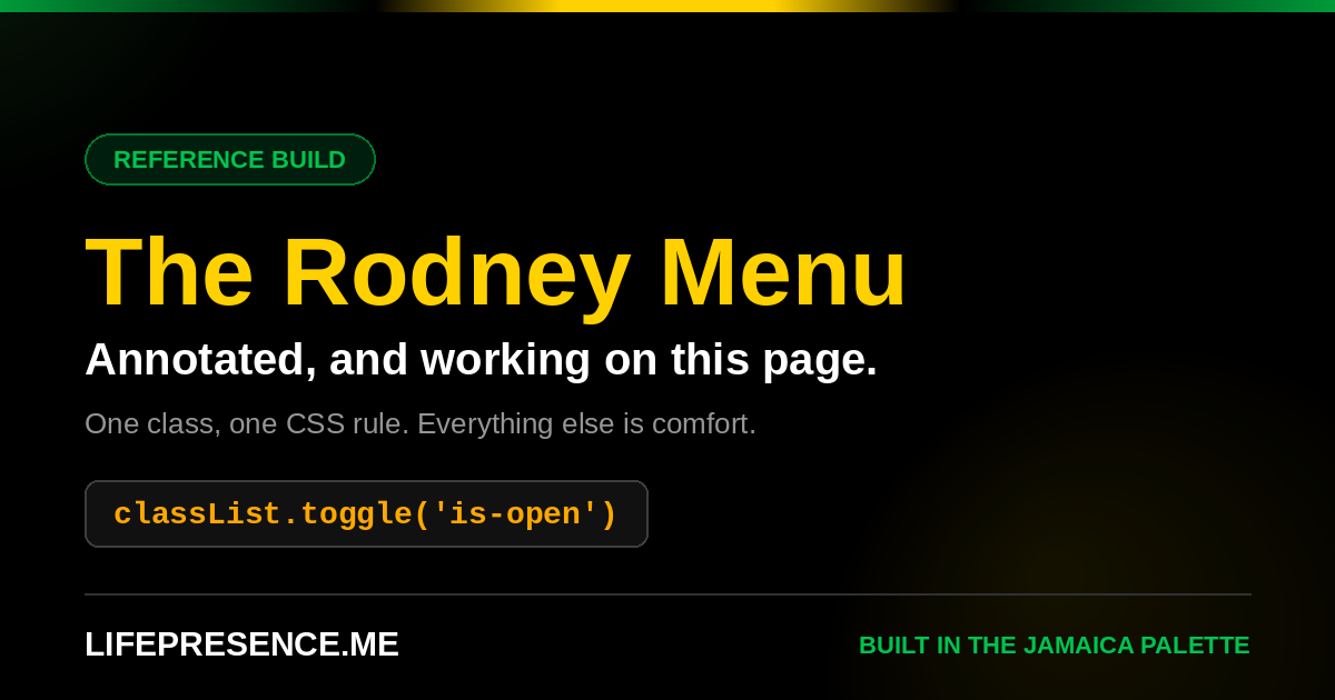
The Rodney Menu preview card, 1200 by 630, black with the Jamaica stripe across the top
1200 x 630. The only size all of them accept without re-cropping it.

The rules that matter

Gold carries the memory

On that card the only gold things are the name and the line of code. That is the palette rule doing its job: gold is what you are meant to remember, white is what you are meant to read, and green is a label.

Copy This

The meta tags

These go in the head, above everything else. The ?v=1 on the image is not optional, and the next section explains why.

<meta property="og:title" content="The Rodney Menu">
<meta property="og:description" content="One class, one CSS rule. Everything else is comfort.">
<meta property="og:image" content="https://yoursite.com/og-rodney.png?v=1">
<meta property="og:image:width" content="1200">
<meta property="og:image:height" content="630">
<meta property="og:url" content="https://yoursite.com/">
<meta property="og:type" content="website">
<meta name="twitter:card" content="summary_large_image">

What each one is for

Hard Won

What goes wrong

Every one of these has actually happened on a live page.

The old card keeps showing up

You replace og-image.png, redeploy, send the link, and WhatsApp shows yesterday's card. Nothing is broken. WhatsApp and Facebook cache the scrape by URL and they hold it for a long time.

The fix is to change the URL, not the file. Bump ?v=1 to ?v=2 in the meta tag every single time you change the image. The file name stays the same, the URL the scraper sees is new, and the cache no longer applies.

Test in a new chat, not the old one. Even after a version bump, a thread that already has the old preview in it will often keep showing the old preview. That is the message, not the page.

The jump link goes to the wrong place

It does not. The section is under the sticky bar. Add scroll-margin-top:96px to your sections and it stops.

The panel will not scroll

You added an eleventh link and the last two cannot be reached. You are missing max-height and overflow-y:auto on .mega.

The menu opens and immediately closes

You put closeNav() on the burger as well as the links, or the burger is inside the .mega panel rather than above it in .nav-inner.

Tapping the burger submits the form

Missing type="button". A button inside a form defaults to submit.

The X does not close properly

You changed the bar height or the gap and did not change the 10px translate to match. The formula is gap plus bar height.

A hidden link shows anyway

Your .mega a rule sets display:flex, which beats the browser's handling of hidden. Add .mega a[hidden]{display:none}.

Before You Ship

The checklist

One last thing. Open this page on your phone and tap through every link in the menu. Ten links, ten jumps, and the panel should close every time. If you can do that without thinking about it, you know the pattern well enough to rebuild it.